

Combinable Block Style Presets
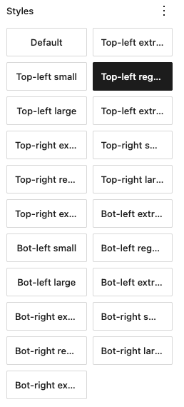
register_block_style() (the native Gutenberg “Styles” tab) is a single select — great for one axis of choice (“rounded” vs “square” vs “outline”), but the moment a block needs two independent axes it falls apart. This happened with the Group block’s border-radius presets: 4 corners × 5 sizes would mean registering 20 mutually-exclusive styles, with no way to combine “top-right large + bottom-left small” without hand-editing the “Additional CSS Class(es)” field.
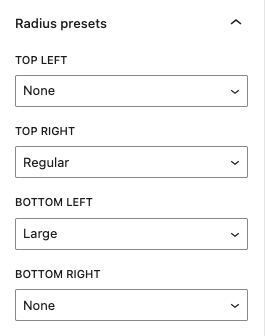
This guide walks through a small, reusable engine that fixes that: instead of registering combinations as block styles, it adds an Inspector panel with one dropdown per axis. Each dropdown independently toggles a class, so combining axes is just picking from each dropdown.
The fix
Section titled “The fix”Don’t register the combinations, register each axis as its own class prefix (e.g. has-icon-, is-style-border-radius-top-left-) and add one dropdown per axis to a panel. Each dropdown just adds/removes {prefix}{value} on the block’s className independently of the others. Your SCSS reads those classes exactly like it would read an is-style-* class from a real block style — no CSS changes needed.
-
Add the generic engine
Section titled “Add the generic engine”Create
assets/src/js/editor/style-preset-controls.jsin your Blocksy child theme. This file is block-agnostic — copy it as-is, you shouldn’t need to edit it./*** Generic engine for "combinable style presets" Inspector panels.* Adds one dropdown per axis to a block's Inspector. Each dropdown* independently toggles a `{prefix}{value}` class, so any combination* of axes can be applied at once.*/(function (wp) {const { addFilter } = wp.hooks;const { createHigherOrderComponent } = wp.compose;const { Fragment, createElement } = wp.element;const { InspectorControls } = wp.blockEditor;const { PanelBody, SelectControl } = wp.components;const axisClassRegExp = (prefix, values) =>new RegExp(`(^|\\s)${prefix}(${values.join('|')})(?=\\s|$)`);const getAxisValue = (className, prefix, values) => {const match = (className || '').match(axisClassRegExp(prefix, values));return match ? match[2] : '';};const setAxisValue = (className, prefix, values, value) => {const withoutAxis = (className || '').replace(axisClassRegExp(prefix, values), '').replace(/\s+/g, ' ').trim();return value ? `${withoutAxis} ${prefix}${value}`.trim() : withoutAxis;};function registerStylePresetControls(config) {const { blockName, namespace, panelTitle, groups, initialOpen = false } = config;const withStylePresetControls = createHigherOrderComponent((BlockEdit) => (props) => {if (props.name !== blockName) {return createElement(BlockEdit, props);}const { attributes, setAttributes } = props;return createElement(Fragment,{},createElement(BlockEdit, props),createElement(InspectorControls,{},createElement(PanelBody,{ title: panelTitle, initialOpen },groups.map((group) => {const values = group.options.map((option) => option.value).filter(Boolean);return createElement(SelectControl, {key: group.key,label: group.label,value: getAxisValue(attributes.className, group.prefix, values),options: group.options,onChange: (value) =>setAttributes({className: setAxisValue(attributes.className,group.prefix,values,value,),}),});}),),),);},'withStylePresetControls',);addFilter('editor.BlockEdit', namespace, withStylePresetControls);}window.BlocksyChild = window.BlocksyChild || {};window.BlocksyChild.registerStylePresetControls = registerStylePresetControls;})(window.wp);This is a plain script that only touches global
wp.*APIs, so it doesn’t need to go through a build step. -
Enqueue the engine
Section titled “Enqueue the engine”Add this to your theme’s
inc/enqueue.php(any PHP file ininc/is auto-included, so a new file works just as well):/*** Enqueues the combinable style-preset controls engine.*/function enqueue_theme_style_preset_controls(){$relativePath = '/assets/src/js/editor/style-preset-controls.js';wp_enqueue_script('blocksy-child-style-preset-controls',get_stylesheet_directory_uri() . $relativePath,['wp-hooks', 'wp-compose', 'wp-element', 'wp-block-editor', 'wp-components', 'wp-i18n'],filemtime(get_stylesheet_directory() . $relativePath),true);}add_action('enqueue_block_editor_assets', 'enqueue_theme_style_preset_controls'); -
Register a panel for your block
Section titled “Register a panel for your block”For each block/panel you want, create a small file that calls
registerStylePresetControls()— one entry per axis. For example,assets/src/js/editor/group-radius-controls.jsfor a per-corner border radius on the Group block:(function (wp) {const { __ } = wp.i18n;const CORNERS = [{ key: 'top-left', label: __('Top left', 'blocksy-child') },{ key: 'top-right', label: __('Top right', 'blocksy-child') },{ key: 'bottom-left', label: __('Bottom left', 'blocksy-child') },{ key: 'bottom-right', label: __('Bottom right', 'blocksy-child') },];const SIZES = [{ value: '', label: __('None', 'blocksy-child') },{ value: 'small', label: __('Small', 'blocksy-child') },{ value: 'regular', label: __('Regular', 'blocksy-child') },{ value: 'large', label: __('Large', 'blocksy-child') },];window.BlocksyChild.registerStylePresetControls({blockName: 'core/group',namespace: 'blocksy-child/group-radius-controls',panelTitle: __('Radius presets', 'blocksy-child'),groups: CORNERS.map((corner) => ({key: corner.key,label: corner.label,prefix: `is-style-border-radius-${corner.key}-`,options: SIZES,})),});})(window.wp);Enqueue it the same way as step 2, but list
'blocksy-child-style-preset-controls'as a dependency so the engine loads first:function enqueue_theme_group_radius_controls(){$relativePath = '/assets/src/js/editor/group-radius-controls.js';wp_enqueue_script('blocksy-child-group-radius-controls',get_stylesheet_directory_uri() . $relativePath,['blocksy-child-style-preset-controls', 'wp-i18n'],filemtime(get_stylesheet_directory() . $relativePath),true);}add_action('enqueue_block_editor_assets', 'enqueue_theme_group_radius_controls'); -
Add the SCSS
Section titled “Add the SCSS”Write the CSS for each class exactly like you would for any
is-style-*class — nothing about the CSS changes, only how the class ends up on the block:.is-style-border-radius-top-left-small { border-top-left-radius: 0.5rem; }.is-style-border-radius-top-left-regular { border-top-left-radius: 1rem; }.is-style-border-radius-top-left-large { border-top-left-radius: 2rem; }// ...repeat per corner
Customization
Section titled “Customization”To adapt this for another block, add another registerStylePresetControls() call with its own blockName, namespace, and groups. Axes don’t have to be about size — a Button block could have an “icon” axis and an “icon position” axis instead:
window.BlocksyChild.registerStylePresetControls({ blockName: 'core/button', namespace: 'blocksy-child/button-icon-controls', panelTitle: __('Icon presets', 'blocksy-child'), groups: [ { key: 'icon', label: __('Icon', 'blocksy-child'), prefix: 'has-icon-', options: [ { value: '', label: __('None', 'blocksy-child') }, { value: 'arrow', label: __('Arrow', 'blocksy-child') }, { value: 'pdf', label: __('PDF', 'blocksy-child') }, ], }, { key: 'icon-position', label: __('Icon position', 'blocksy-child'), prefix: 'has-position-', options: [ { value: 'left', label: __('Left', 'blocksy-child') }, { value: 'right', label: __('Right', 'blocksy-child') }, ], }, ],});